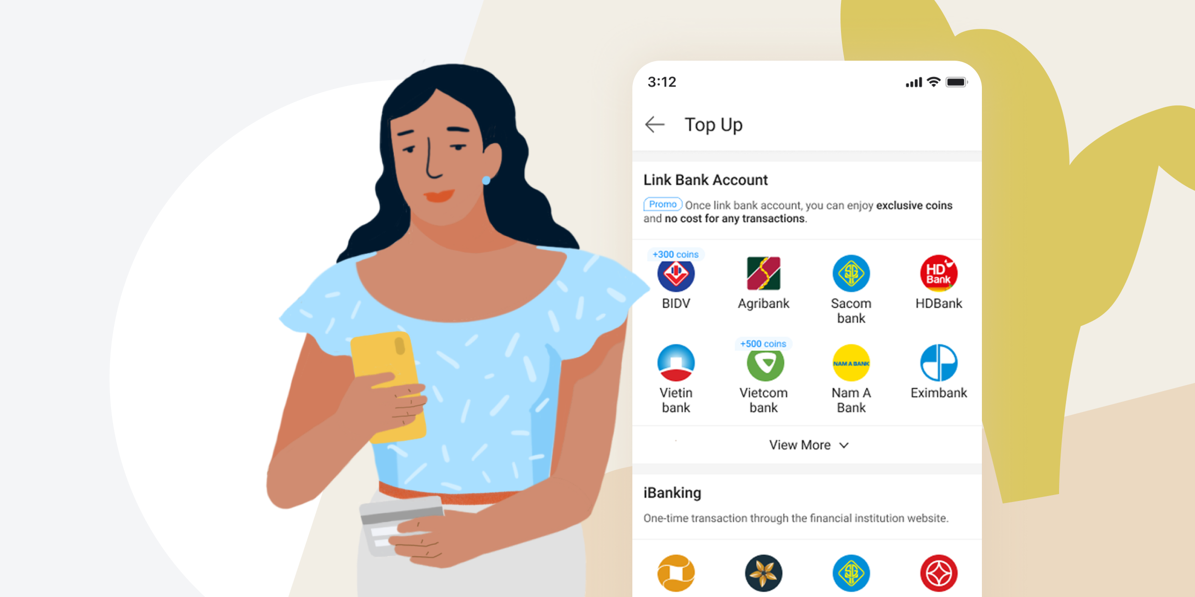
A design-driven project that improves the transaction conversions for new users and increases product confidence.
My Role: UX/UI Designer
Duration: Mar – May'19 (2 months)
Cooperated with 1 PM, BI team, CX team
According to our marketing annual report 2018, online payment acceptance gradually grew by 60%, especially in Vietnam. In the meantime, we start to serve the e-commerce platform, new users remarkably grow. But the number of transactions wasn’t positively correlated.
In order to understand why the transaction conversions are low for new users, I put forward a UX audit to discover the possible reasons.
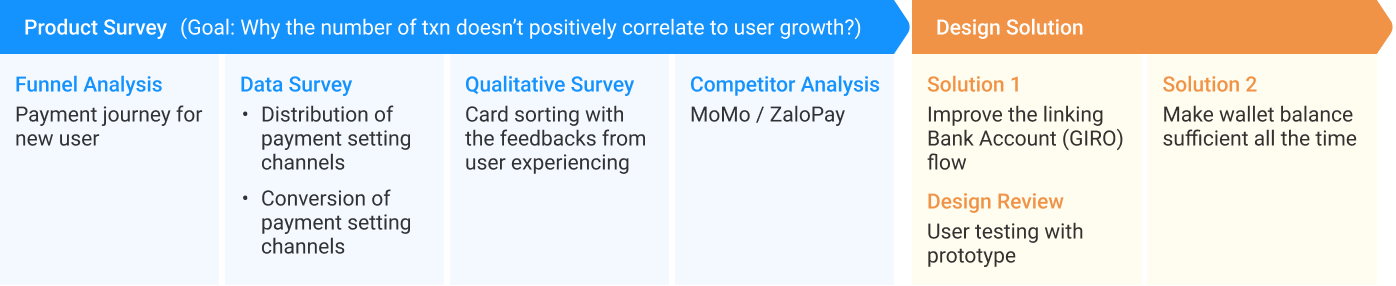
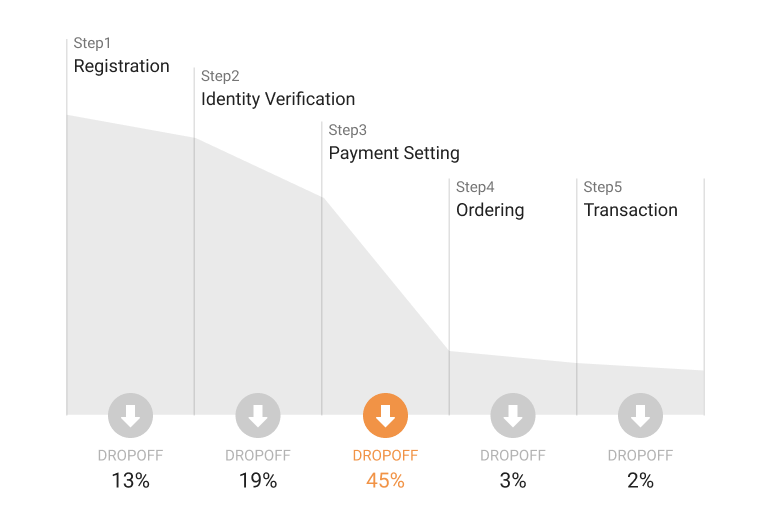
A journey to new users completing a transaction will go through registration, identity verification, setting a payment method, order, then payment.
We defined metrics with the BI team and reviewed the drop-off rate in each step for the past 6 months. The result shows the worst performance in setting up payment methods. Once completing the setting, it drives higher retention.
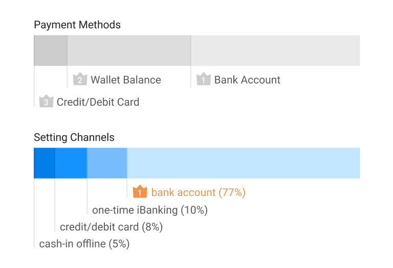
To understand the user payment behaviour, first of all, we break down all transactions by payment methods. Users can top up their wallet to pay with balance, or link payment cards like a bank account (BA) or credit/debit card (CC) to directly pay by card. As a result, more than half of users pay by BA, the second most popular payment is Wallet, and CC is the last.
Then we further breakdown divide into setting channels. In addition to linking payment cards, there are three ways to top up wallet: bank account, one-time iBanking, and cash-in at the offline ATM/Counter. If we see the distribution of setting channels, enormous user set their payment method by linking a bank account.
To understand the performance of each setting channel, we reviewed the conversions in different setting flows. It comes out the linking BA got the worst performance, especially those banks that allow user links on their website page only. Linking BA needs authorization from the bank. If the bank grants us protocol access permission, we can verify by API in-app which is more efficient and stable.
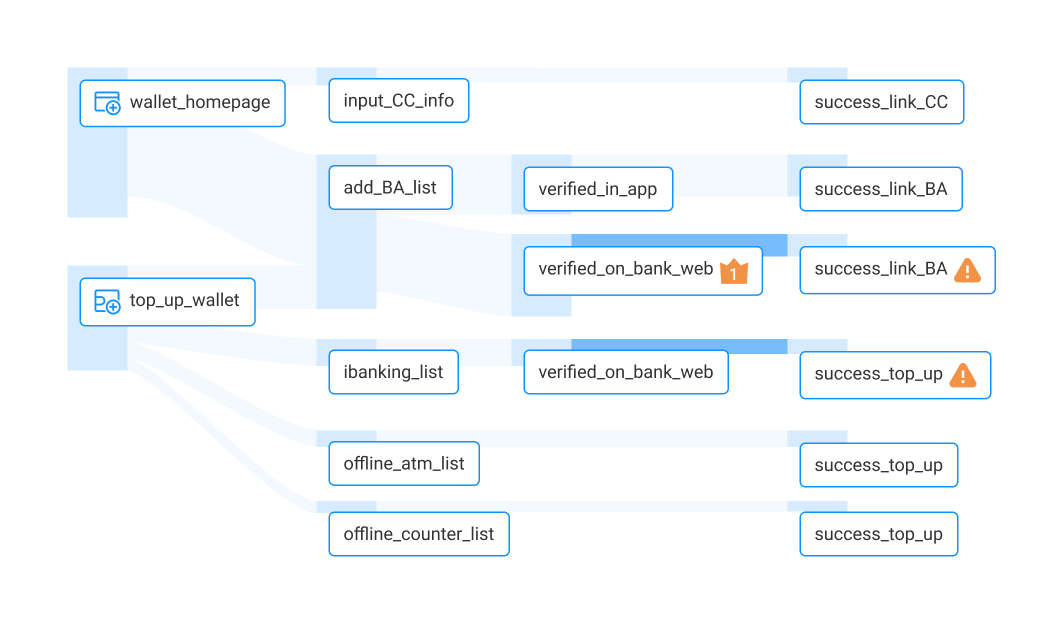
Now we narrowed down the problem into the linking BA flow. I expect to get insights from empathizing with simultaneous discussion and participants' perspectives.
Considering the budgets and limited timeline, I invite our internal folks to be the participants. Three of them are Vietnamese, have digital wallet experience, and have never used AirPay before. They process the thinking aloud then work together in the closed card sort. The cards are the negative comments from the customer weekly report in the last 2 months, which filter out similar problems to 42 valid comments.
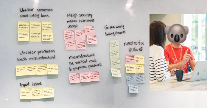
We cannot offer the bank service without their authorization. We neither can nor process the bank verification without accessing protocol permission.
Instead of poor network performance in local marketing, as secure data transmission, it needs additional deals like encryption and decryption that may raise the error probability.
There are restricted services under bank regulation. Users are misunderstanding and distrust with unclear information. Besides, some banks do the promotion to increase members. Users feel betrayed when they didn’t get the expected promotion with unclear remarks.
Different payment channels support different banks. User confuses that cannot find needed bank cause they go the wrong linking channels.
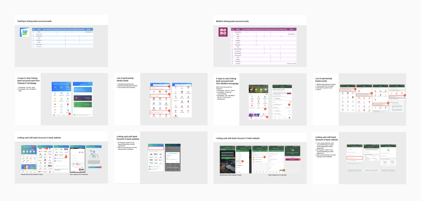
The other two popular products are MoMo and ZaloPay. We curious about how they deal with the same issue. In summary, for the total available banks, MoMo is as much as we are. Both of them have different types of linking flow due to the protocol restriction. The performance of linking on bank's website is still unstable and poor, but the proportion of this type flow is pretty less than us.
I try to think along any potential improvements under the restriction. Here are two major routes to get around: one is for linking bank account flow, assist everything to avoid user jumped out; another is ensure sufficient wallet balance, then user can pay by wallet all the time.
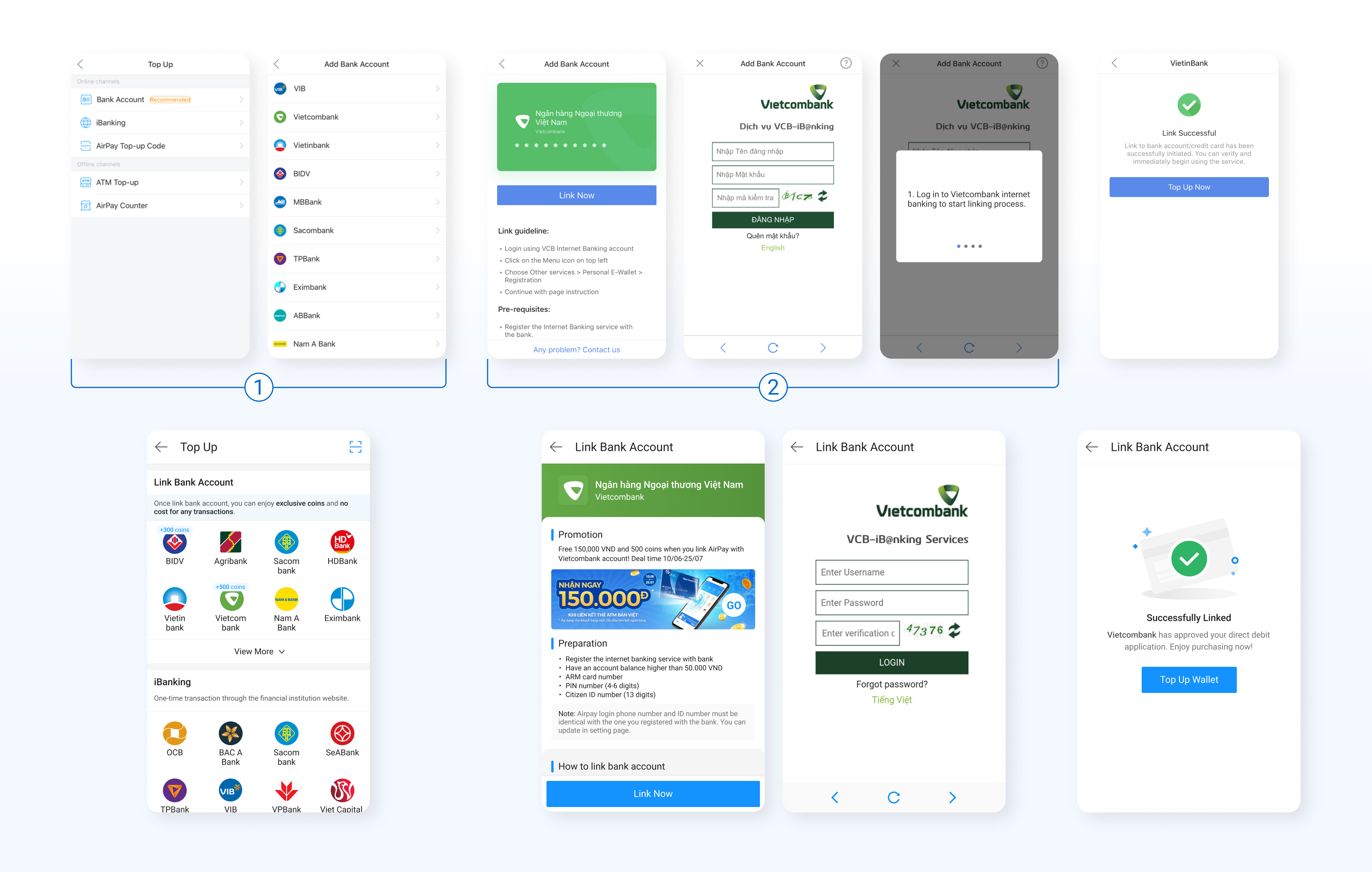
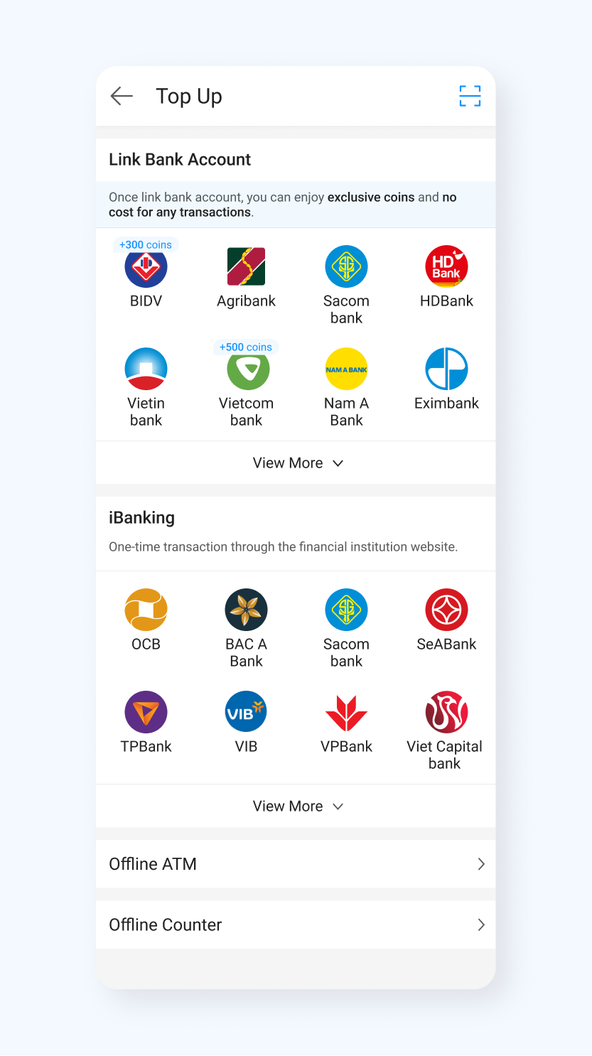
More than 85% of user top up with BA and iBanking. We confidently fold up the offline channels and collapse the relevant options to reduce the cognitive fatigue.
Most of users instinctually find the bank they have first then choose the channels. We expand the BA and iBanking section with the supporting banks to make them more visible and shorten the process as well.
We floor the enlarged bank logo sorting by popularity. User can choose their favorite bank hassle-free.
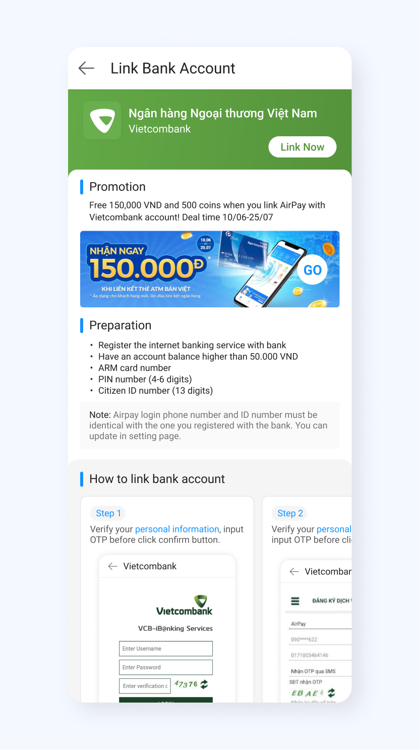
AirPay provides benefits to promote the banks with an in-app authorization process. Others are banks promotion for their own.
Most test user mentioned, they feel insecure and unsafe while it jumps to the website page without enough information. Besides, the scrappy indicators are going nowhere. Many test users overlooked the help icon at the top-right corner. Also, the text indicator is unfriendly to read.
To save the space for useful information, we remove the visual card and make an effort to collect and revise the content for each bank requirements.
Increase the marketing area for bank promotion. Users can get more detail on the branch page.
Guild user with the existing screenshots and concise instruction makes it easier to follow. Users can prepare the requirements first and get the process smooth.
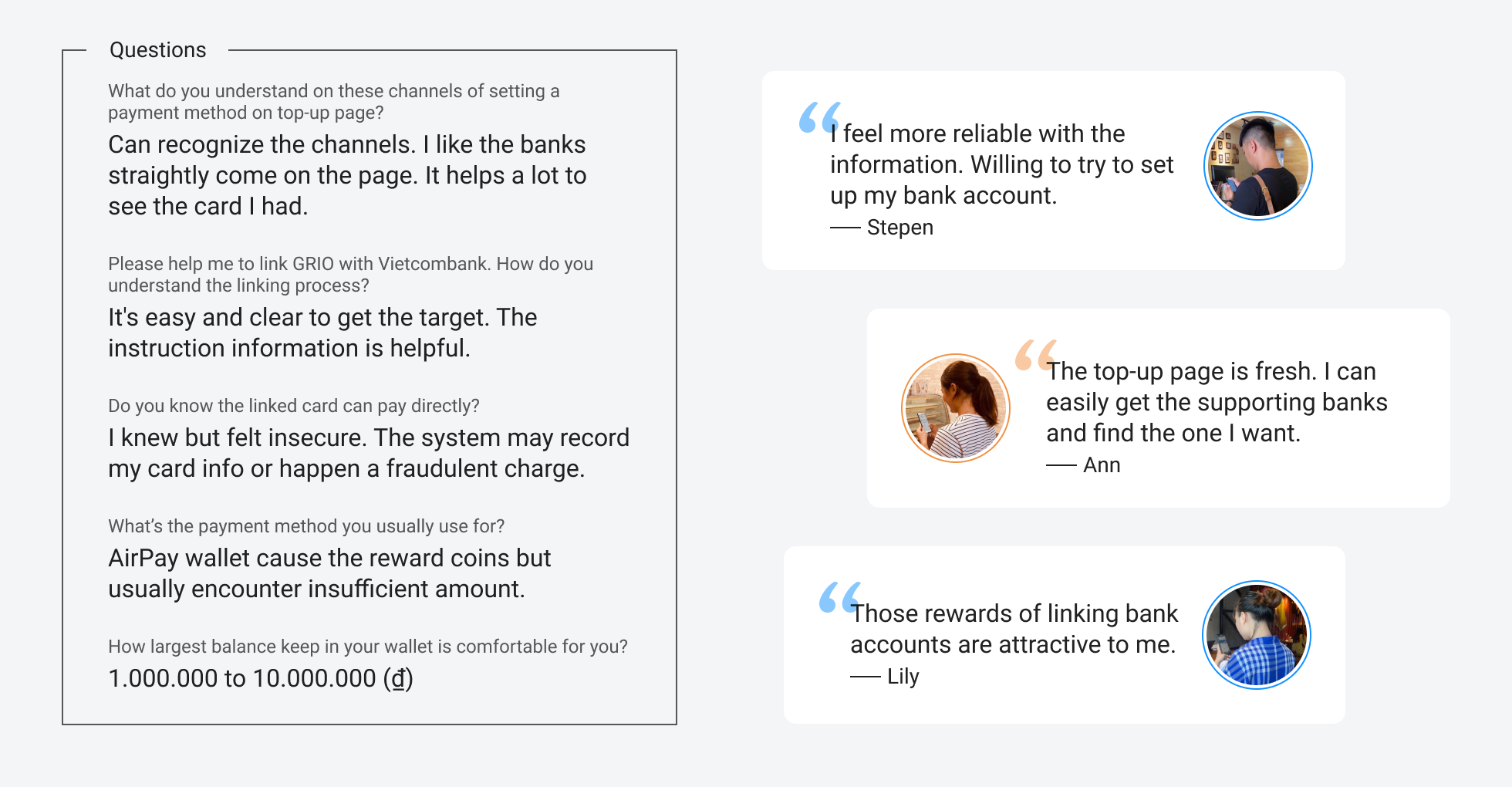
To know how users perceive and use our redesign, wondering does it really enhance user to set payment method, I plan a small user testing with prototype. Three of participants are using AirPay in Vietnam.
The result of their feedback is overall positive. They felt reliable and trusted on redesigned bank entrance page due to the transparent information and real indicators. Also, the spreading banks on the top-up page help them quickly get the supporting banks and choose the suitable one. Besides, we received some comments about the confusion for other channels; and the relevant points about balance. We note them down for further improvement.
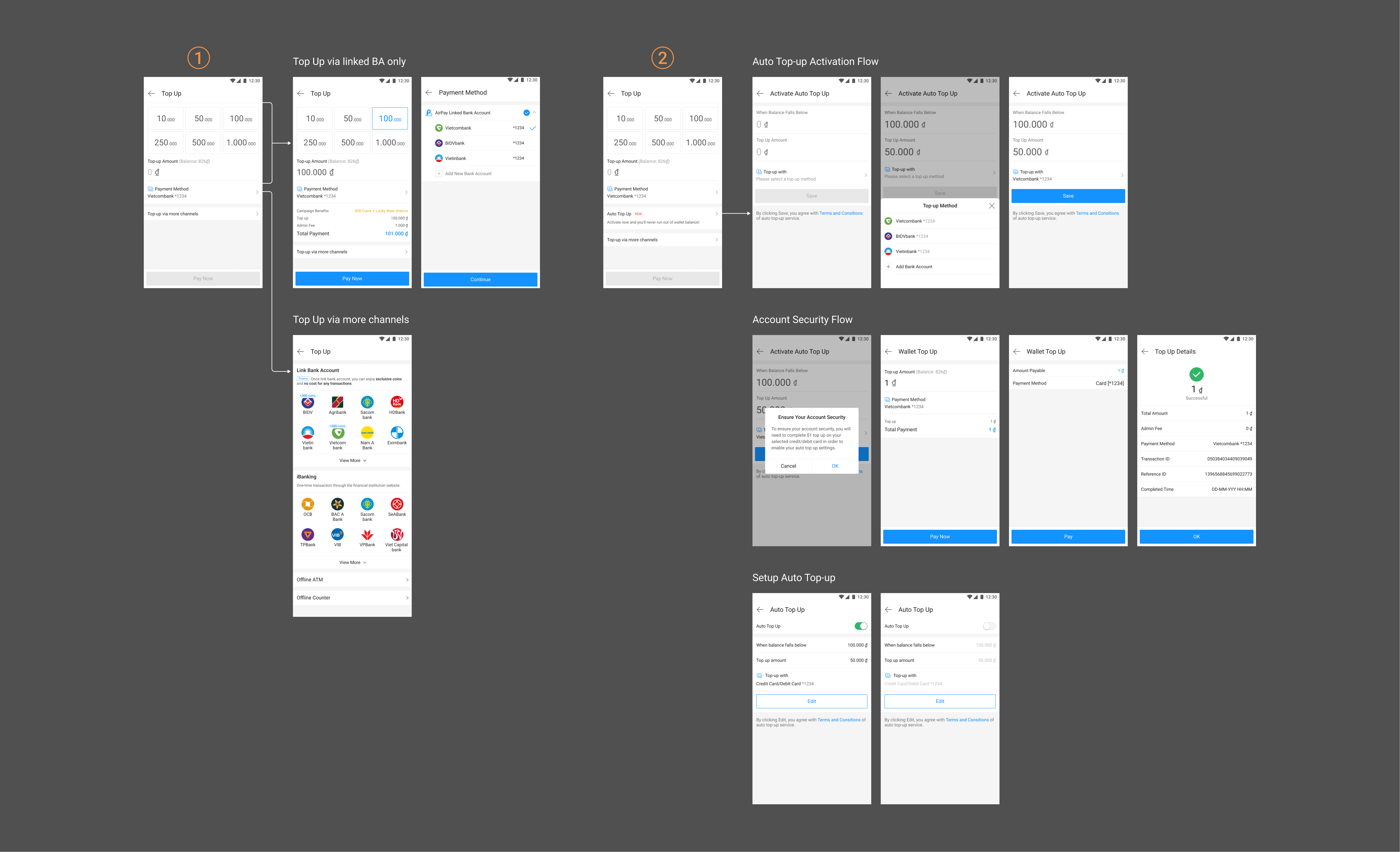
Once users link the bank account, the bank gives the direct debit authorization to AirPay. We can ask the bank to effect authorized deductions. It is no need to verify every time when using this account. It will be pretty convenient for users making payments.
We let users default this efficient way by changing the top-up page after users linked their bank accounts. Users can input the amount then top up right away. Meanwhile, users can pay by other methods as usual. Launched in Aug 2019
Moreover, a new feature for users is that users can preset up their top-up plan. AirPay will auto top up with the amount stated when the balance falls below the minimum balance. Users can opt-in or opt-out and reset their preferences anytime. Launched in Nov 2019
This project has been an exciting and rewarding journey for me. I am so grateful to have the opportunity of conducting the design-driven process. A few things I learned were:
There was no hard timeline and specific initiatives, it was put in low priority down surely. Reaching out the source with diverse knowledge to support this project was the most challenging part. It’s important to plan well in advance for hosting the efficient discussion and making participants thinking it’s value and keen to work on it.
It was my first time to raise the data report requirement. I learnt a lot while working on the conversion of different setting payment channels. Since the structure was a bit complicated, I put the time on definding the scope of filtering the valid data, and make sure the outcome close to fact. The report definitly provided a easy way for everyone to understand the situation and better aligned on agreements.
I recognize that while data are important for understanding customer behaviour, they’re short on empathy. I seek to go far beyond understanding what customers wnat to truly uncovering why they want it.

